Change is what the web is about
I wrote this for our corporate blog. Rather than give everyone I know instructions for connecting to our VPN, I thought I'd reproduce it here. The gist is: as we go through a lot of change both process-wise and philosophically, we need to make sure nobody gets too attached to one way of thinking and gets left behind.
Since its inception, the Web has undergone constant evolution. But along the way, it’s also gone through some major revolutions that left it forever changed — and left some people behind.
Purty Pitchers
The first earth-shattering change was the NCSA Mosaic browser. Why? One word: graphics. Color graphics! You wouldn’t think this would bother anyone: sure, they took a long time to load and were really awful quality purplish GIFs for a long time, but being able to navigate around a web page with your mouse and scrollbar really opened up the web to a lot of people who would never have touched the green-on-black terminal browser Lynx.
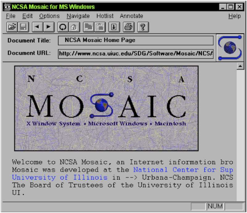
Still, there were casualties: the early denizens of the internet, the super tech-savvy terminal jockeys and ASCII artists who preferred the music of a ker-chunking IBM Model M keyboard to the click of a mouse saw their little private utopia being taken away. In a way, I can sympathize. They were probably worried it’d be filled with n00bs, dads and ads eventually.
But the lesson is there. Adapt or get left behind.
The Blue Beanie
Most of these revolutions have happened during my career. The rise and fall of Flash, the advent of YouTube, blogging… it’s been a fun ride so far.
But from a designer/developer standpoint, something that in hindsight might’ve had the biggest effect was the Web Standards movement. As late as the mid–2000s, we’d been designing pages based on some anonymous genius’s realization that HTML tables and weirdly sliced images could be used to create print-like layouts on web pages. Thus the business of “web design.” But this was a hack, and it helped us grow an appetite for hacks. Meanwhile, Netscape and Microsoft were vying for supremacy in the browser market by adding more and more amazing but completely incompatible features. So we essentially had to build sites twice.
But then Jeffrey Zeldman came along and told us all to try something: first off, stop using tables, because we’re hacking a useful feature of the browser to do something awful it wasn’t meant to do, and second, stop using these browsers’ non-standard features. Start using CSS. Thus the Web Standards Project (and what has come to be called the web standards movement) was born. And this movement effectively ended those dreaded Browser Wars.
Trust me, we’re all better for it. But for a while, there were a lot of designers and developers who didn’t want to abandon their fancy browser features, and didn’t want to stop using tables because they worked! Those people adapted. Or they became irrelevant once the browser makers got on board with the Standards crowd.
Responding to Change
The arrival of web applications was not about just one thing. Faster broadband, AJAX, browsers able to run complex Javascript, web fonts, SVG, and all kinds of other stuff made the web the new platform for software. It’s still getting better. And our desktop computers aren’t the only devices with these front-end capabilities anymore. If I can get my software over the web, and my phone has a really good web browser, I should be able to run the software on my phone, right?
Ethan Marcotte first coined the term “Responsive Web Design” four years ago on A List Apart, and the design world has been pretty… responsive to it. Rather than the conversations I used to have ten years ago over whether we’re going to finally support 1024x768 screens, applications can now resize, reflow, and customize for different screens and devices. It’s a huge change in a way of thinking, but it’s also one more way that web applications are now more like “real” applications: do Microsoft Word or Adobe Photoshop force me into a highly controlled layout that only works at a certain window size?
But like the ASCII art and table layouts, there are going to be some casualties in the new way. I think the concept of “pixel perfection” is one of those. If my application changes from screen to screen and situation to situation, I can’t ever know exactly what it’s going to look like to any particular customer.
And that’s fine.
There’s still room for all the careful and highly thought out work that we’ve always done when crafting web pages and web applications. In fact, our job is more important than ever because there’s no way a print layout designer can ever do what we do: deliver what our customers need, on whatever device they need it. And we don’t have any intention of being left behind.